Case Study / Rooket App / General Assembly - London
Average Success
Average Duration
Missclick rate
Position
Product Designer
Timeline
April to June/2023
Platform
IOS
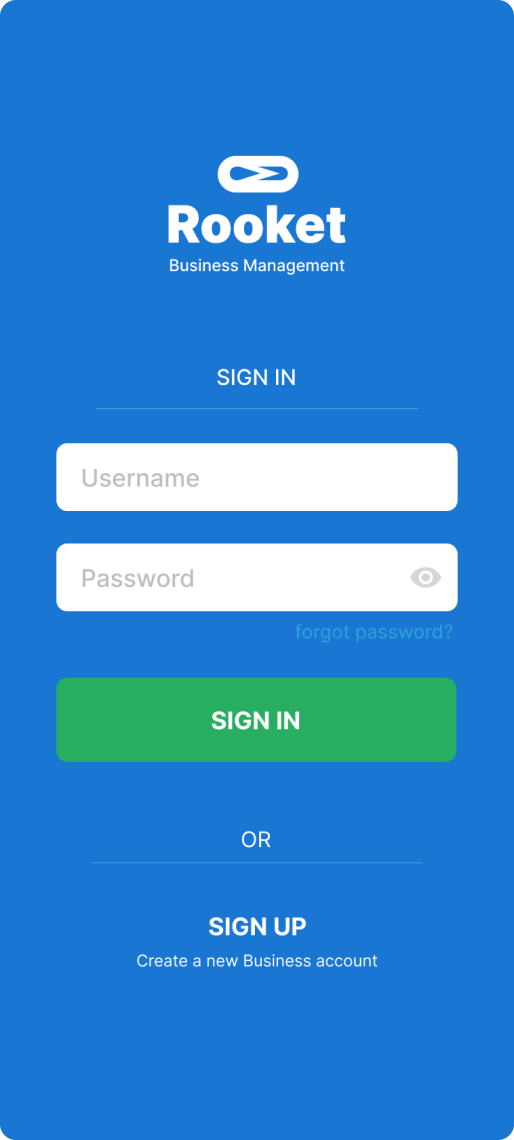
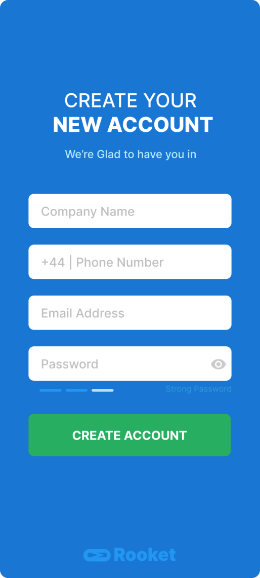
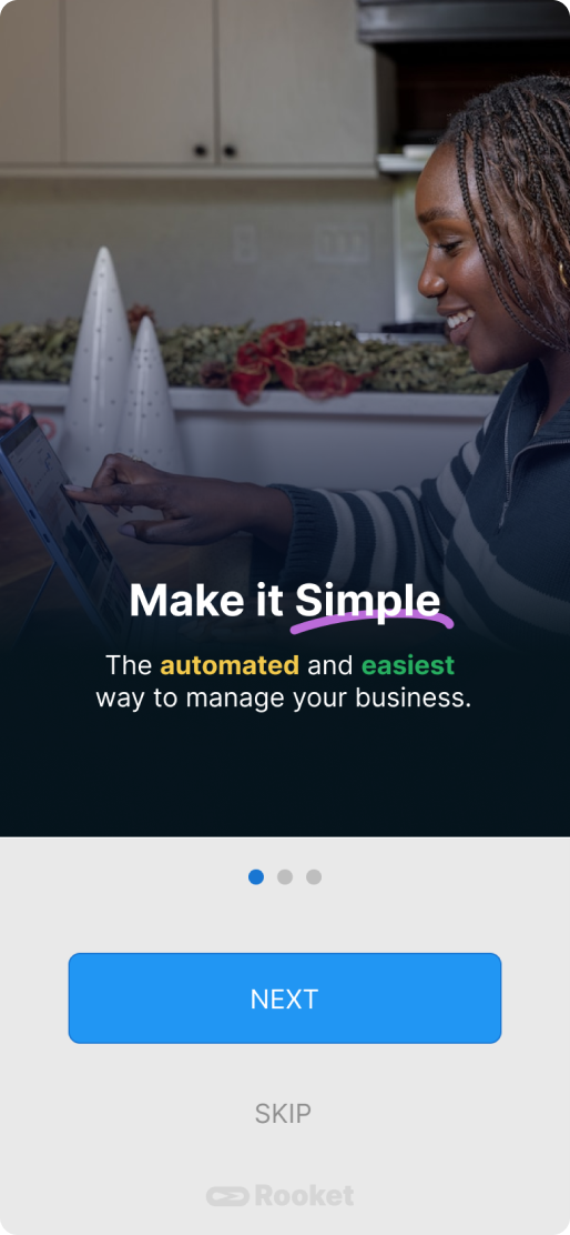
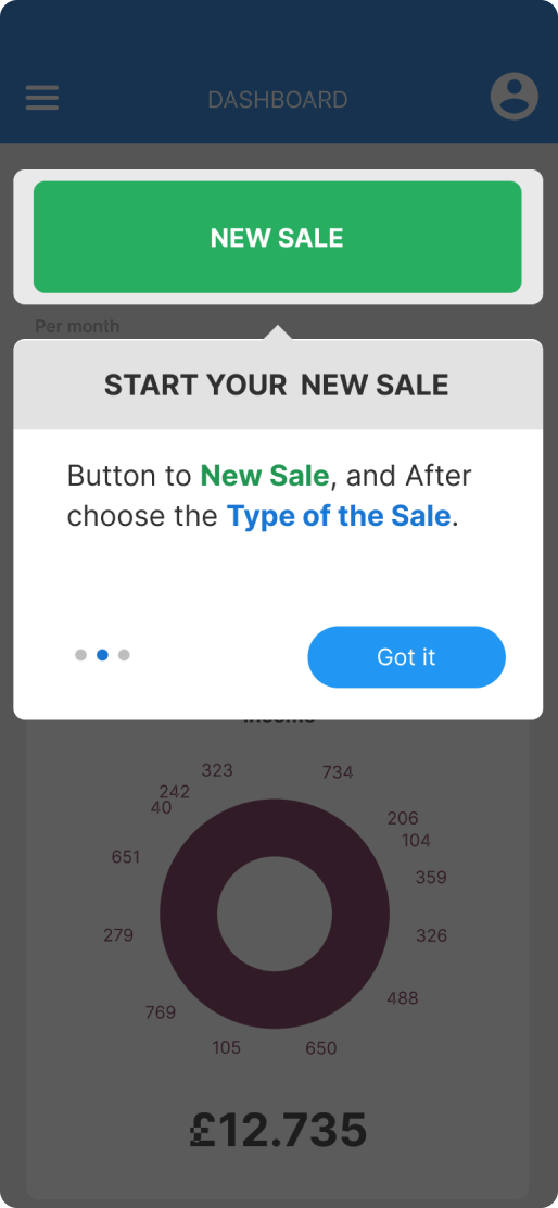
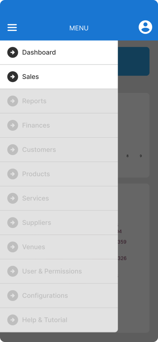
A Simple, Step-by-Step Experience
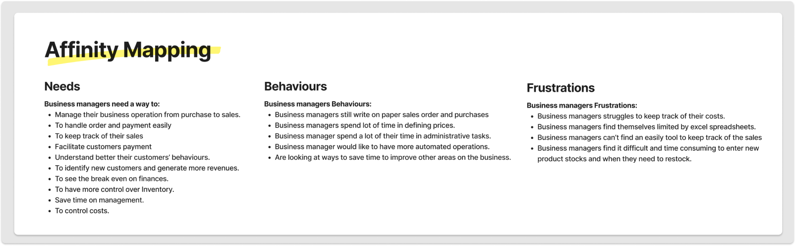
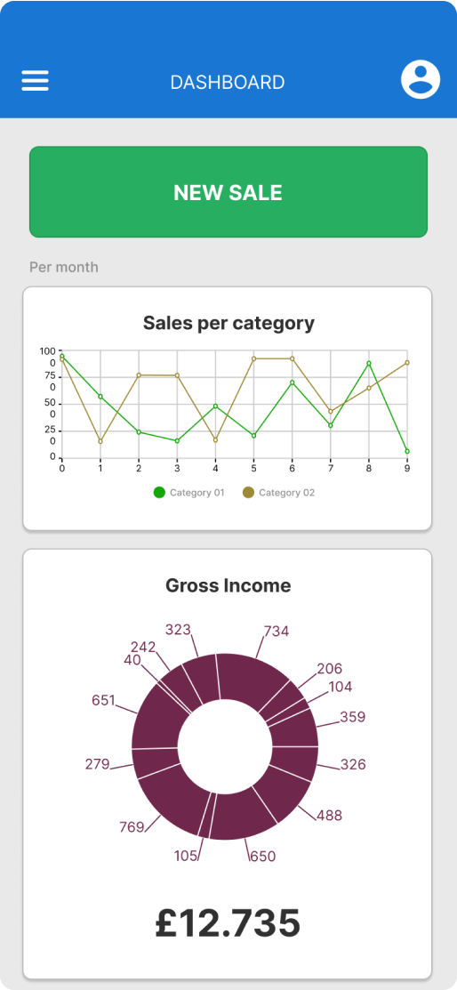
' Managers need a way to handle their sales processes, in order to save time, be more efficient and be organised in their daily operations. ’
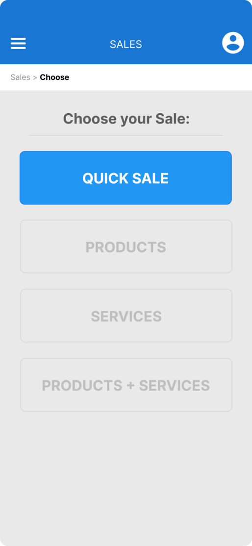
...help business manager handling their operation more easily and intuitively?
...help business manager save time by automate tasks?
...help business manager to bring more efficiency to business operations?
' Managers need a way to handle their sales processes, in order to save time, be more efficient and be organised in their daily operations. ’
...help business manager handling their operation more easily and intuitively?
...help business manager save time by automate tasks?
...help business manager to bring more efficiency to business operations?
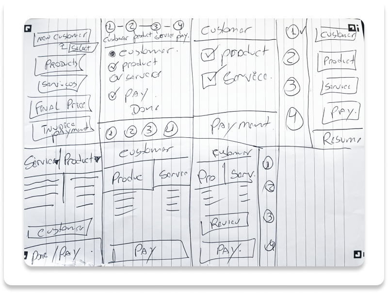
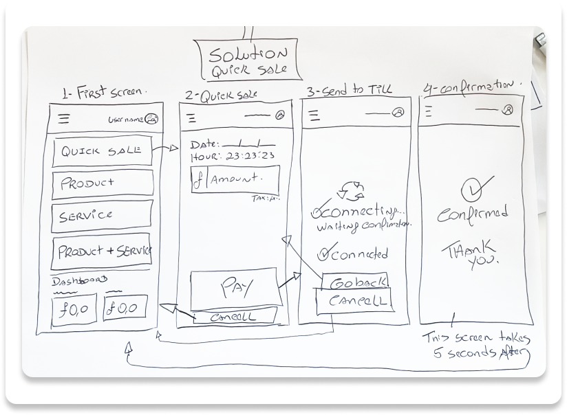
The use of a wireflow greatly aided in understanding the diverse user pathways needed to successfully accomplish the task.
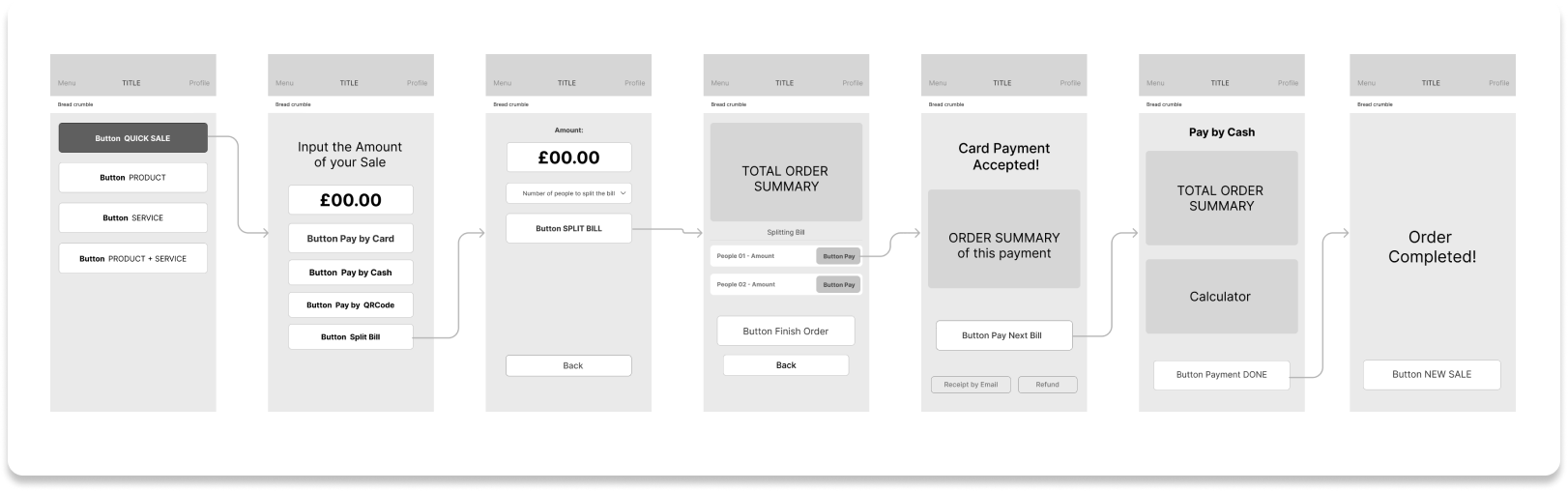
Integrating low-fidelity screens was crucial, as it enabled usability testing without color interference, ensuring a more precise and accurate representation of the outcomes.
Method: Moderated Usability Test.
Data Sourced: Qualitative.
Interviewees: 3.
Job to be done: 1.
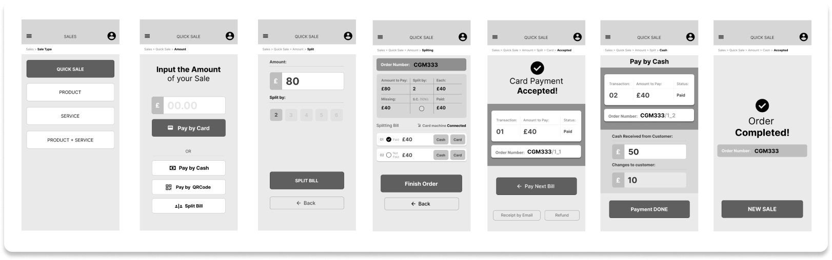
By maintaining the exact low-fidelity screens and introducing colors, followed by a usability re-test, we observed improved results in terms of usability.
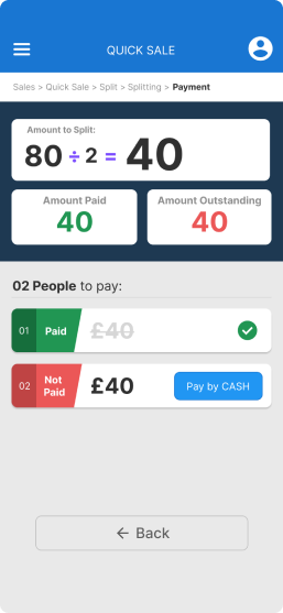
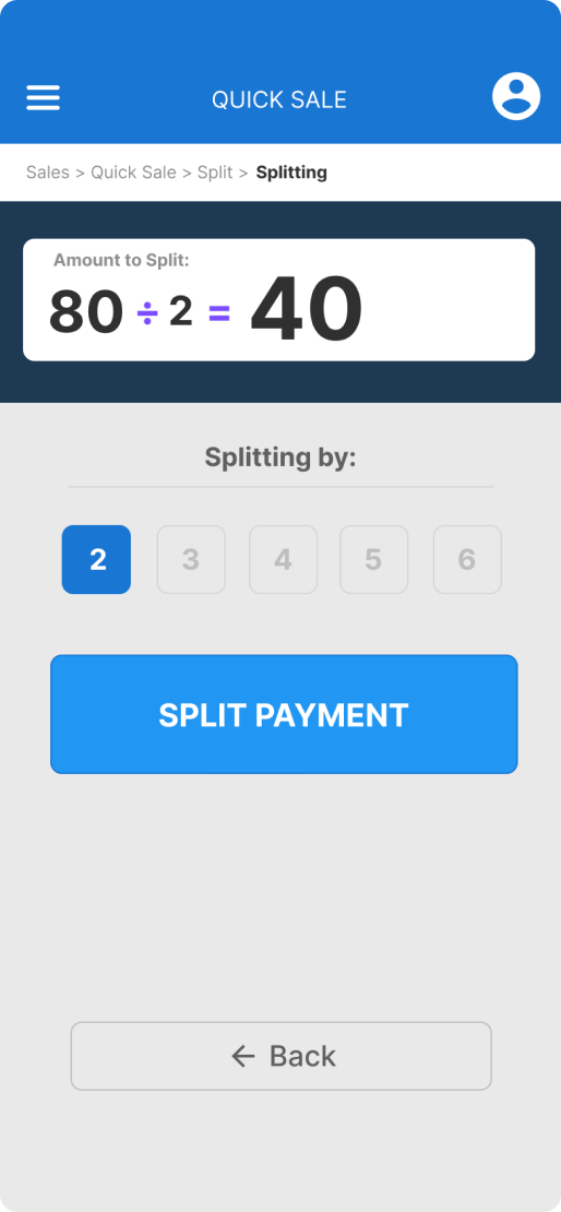
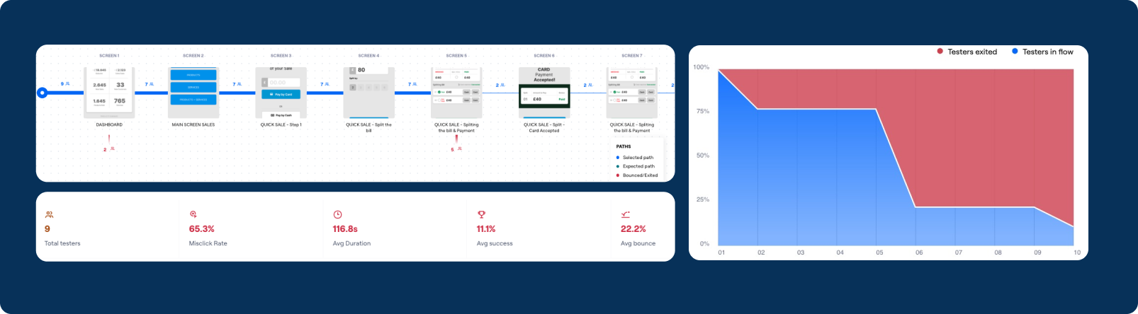
Usability shows that users got stuck on the payment page.
Needed: The usability of the page must be restructured and tested again.
Method: Moderated Usability Test.
Data Sourced: Qualitative.
Interviewees: 9.
Job to be done: 1.
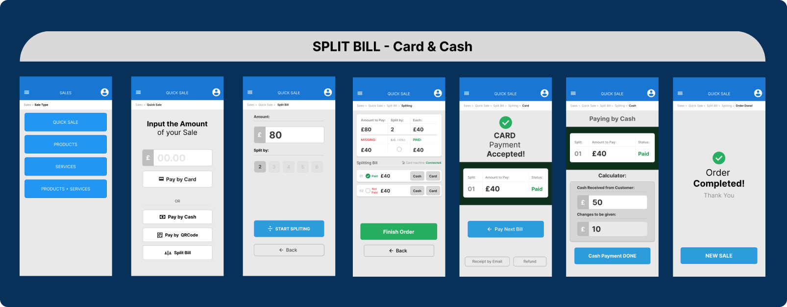
The Split page was re-redesign focused on facilitate the flow and usability to be tested.
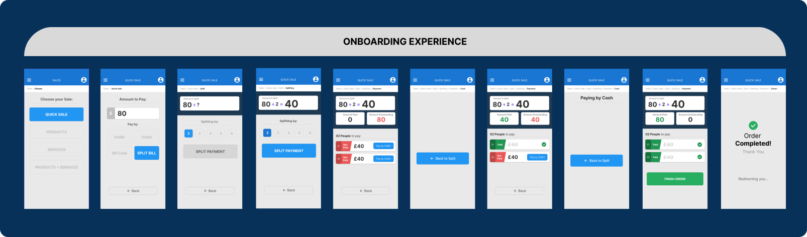
Usability shows that users got stuck on the payment page.
Needed: The usability of the page must be restructured and tested again.
Method: Un-moderated usability test.
Data Sourced: Qualitative.
Interviewees: 14.
Job to be done: 1.
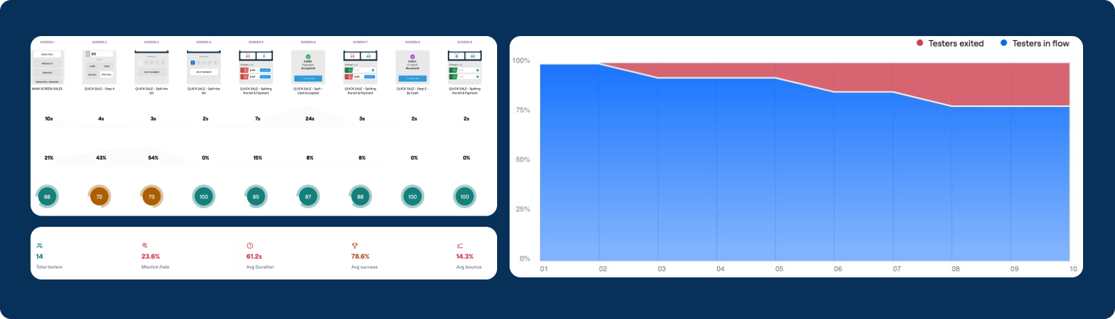
Validated navigation, iterated prototype, evaluated interactions, user-centric design
By modifying the "Book a Table" CTA Button, we achieved a 100% success rate and reduced the booking time to an average of 48 seconds.
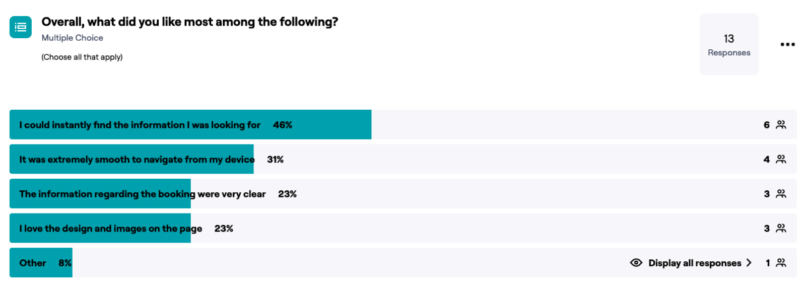
Users expressed their preference for various aspects and features of the revamped design and navigation flow, validating our success in enhancing visual and content hierarchy, along with providing an improved mobile-first navigation experience.
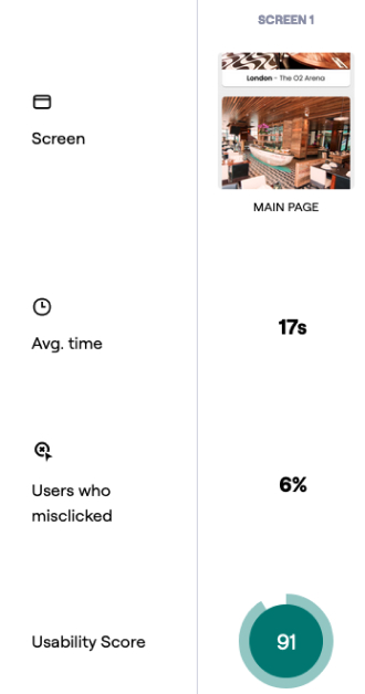
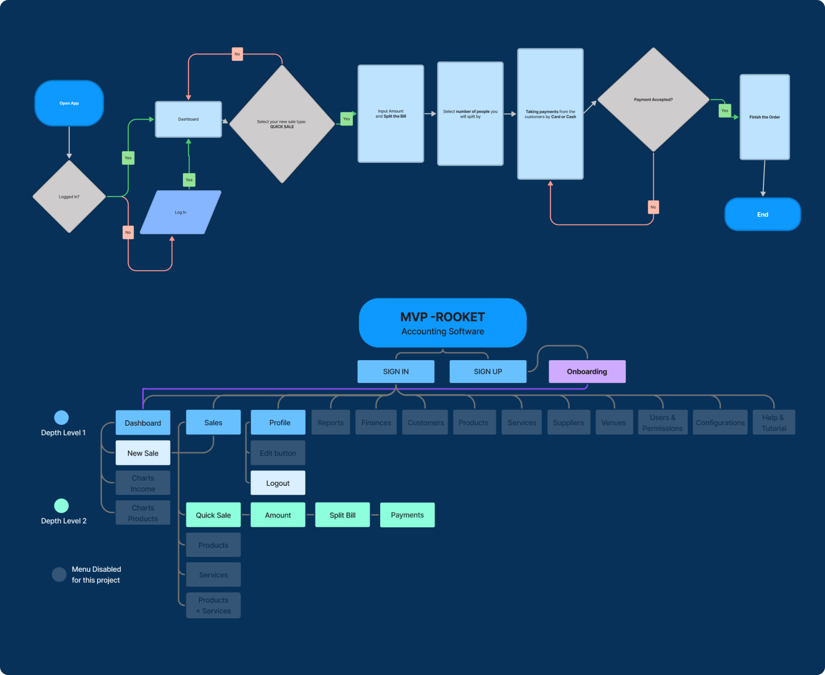
Here is a preview of the final prototype, optimised for navigation for both Mobile and Desktop.
Made in Webflow:
rodiziorico.com
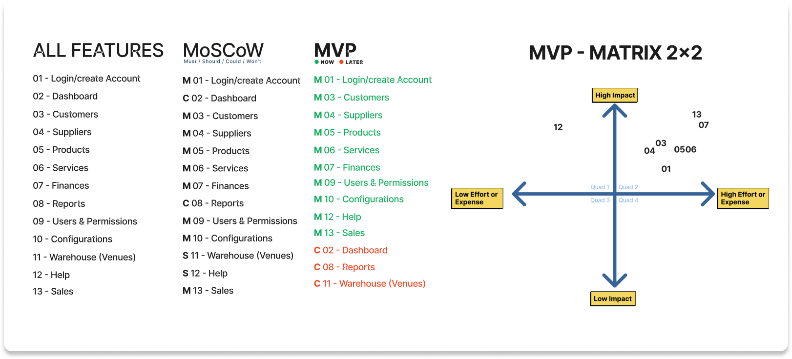
Desinging the minimal solution
Applying the MVP strategy, we swiftly delivered crucial features, reducing user friction and learning iteratively. Staged feature launches helped identify impactful features, generating positive results weekly
Reflecting back on the project
Projects often expand beyond the initial briefing; as user research unfolds, new insights emerge, necessitating additional features to address evolving challenges. Integrations with third parties can introduce sudden changes, altering user journeys and requiring a reassessment of business needs in response to new limitations.
Reflecting back on the project
In this project, I have gained valuable insight into the art of conducting thorough research and synthesising survey data from diverse ethnic backgrounds. By studying various behaviours and preferences exhibited by different ethnicities, I have acquired a deep understanding of how to strategically position elements in UI. This involved careful consideration of the average opinion derived from the survey data, enabling me to make better design decisions.