Rodizio Rico Restaurant / UK
Significant rise in online bookings.
Reduction of venue calls and emails requesting informations.
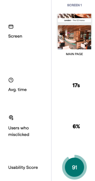
The booking table process now averages just 48 seconds.
Achieving the task of reviewing menu and pricing options within 18 seconds.
Position
Product Designer
Timeline
Apr to Jun/23
Platform
Web
...help clients find the information they want in a timely and accurate manner?
...facilitate the reservation process, (which areas can be improved)?
...make our clients’ online experience more pleasant and efficient?
We investigating the online navigation experience offered based on:
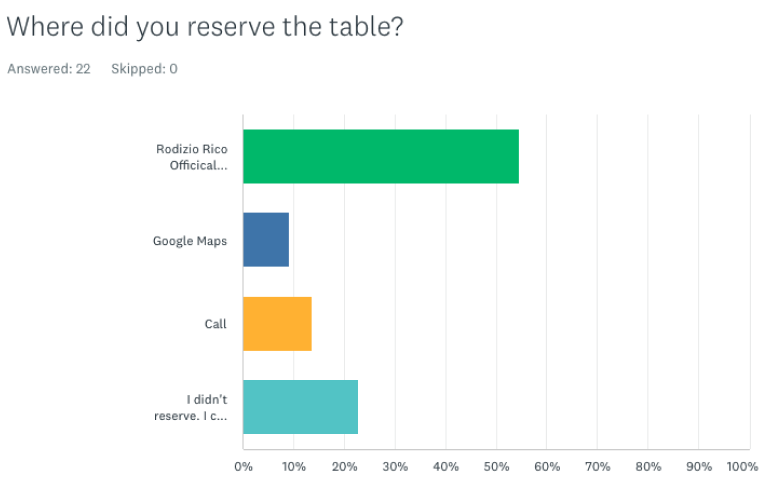
1. Online booking. How does this works?
Are they relying on third parties reservation system?
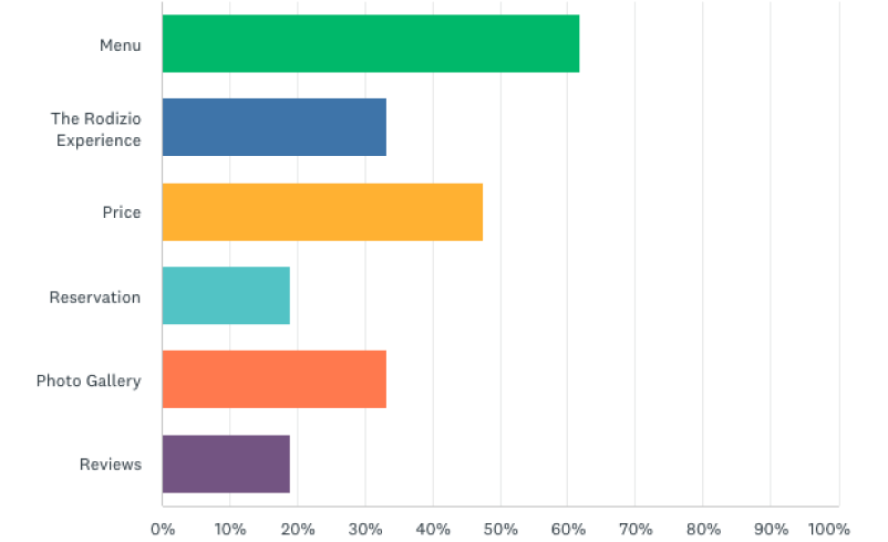
2. Menu and Price visibility and readability.
How easy is for users to browse online menu and different price options?
3. The overall website look & feel and visual design.
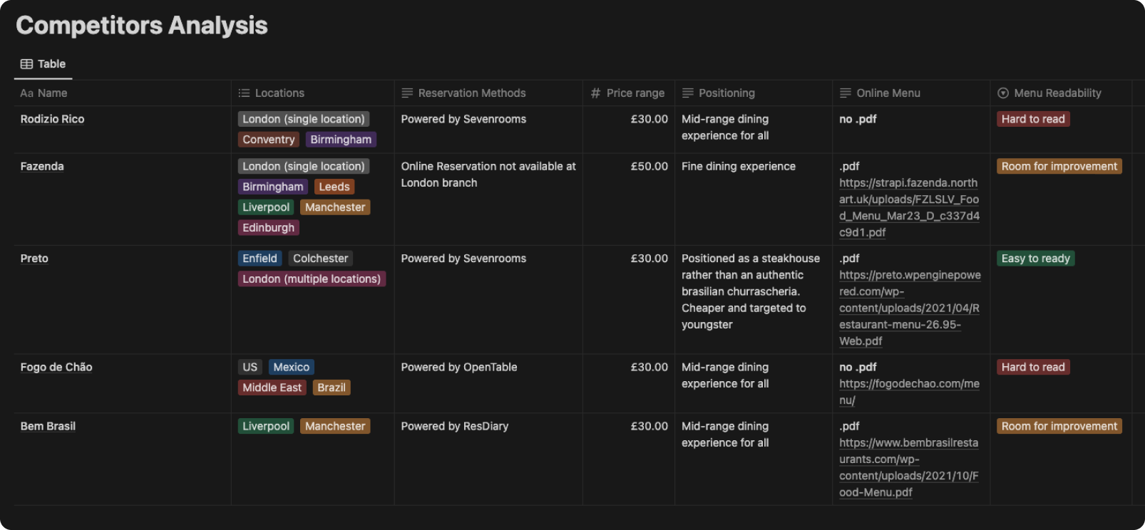
4. Any advantage that differentiate them from competitors.
...help clients find the information they want in a timely and accurate manner?
...facilitate the reservation process, (which areas can be improved)?
...make our clients’ online experience more pleasant and efficient?
We investigating the online navigation experience offered based on:
1. Online booking. How does this works?
Are they relying on third parties reservation system?
2. Menu and Price visibility and readability.
How easy is for users to browse online menu and different price options?
3. The overall website look & feel and visual design.
4. Any advantage that differentiate them from competitors.
Validated navigation, iterated prototype, evaluated interactions, user-centric design.
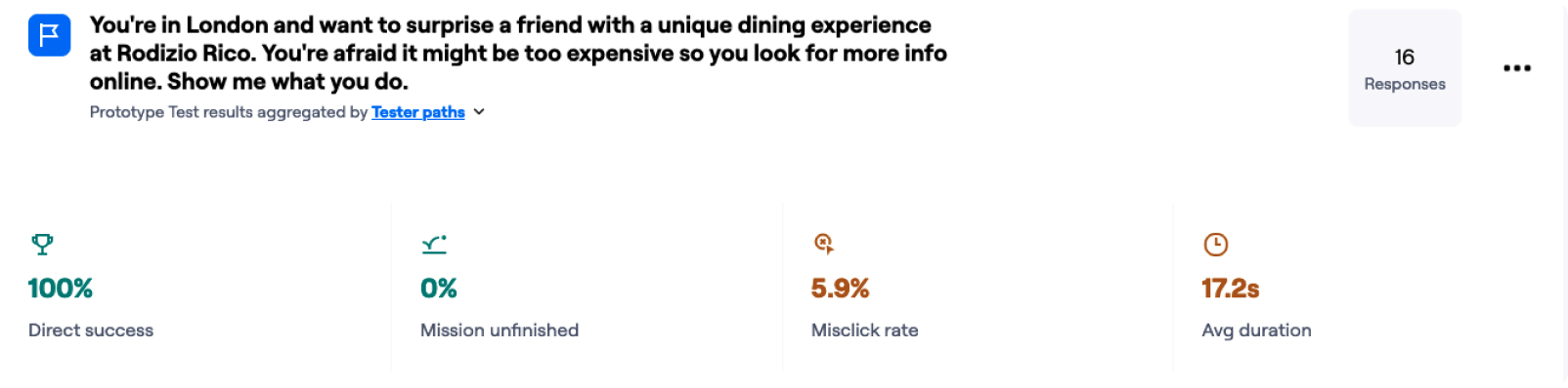
By modifying the "Book a Table" CTA Button, we achieved a 100% success rate and reduced the booking time to an average of 48 seconds.
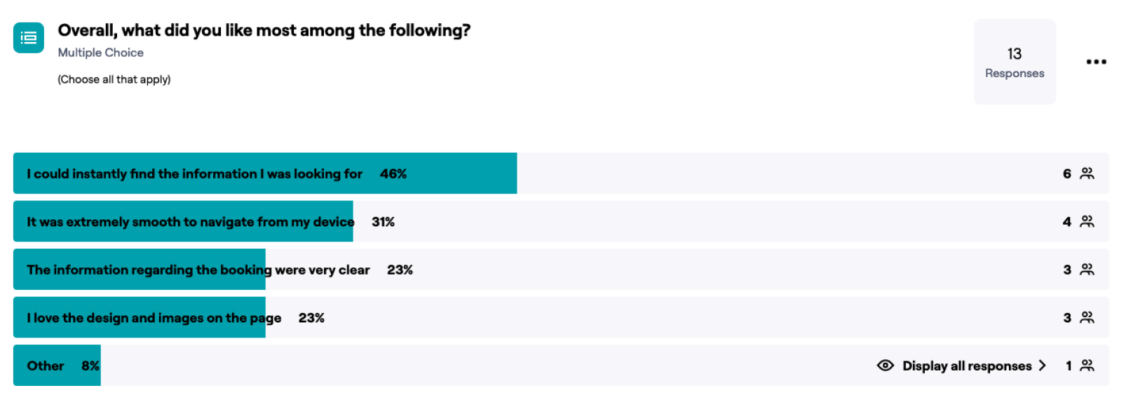
Users expressed their preference for various aspects and features of the revamped design and navigation flow, validating our success in enhancing visual and content hierarchy, along with providing an improved mobile-first navigation experience.
Validated navigation, iterated prototype, evaluated interactions, user-centric design
By modifying the "Book a Table" CTA Button, we achieved a 100% success rate and reduced the booking time to an average of 48 seconds.
Users expressed their preference for various aspects and features of the revamped design and navigation flow, validating our success in enhancing visual and content hierarchy, along with providing an improved mobile-first navigation experience.
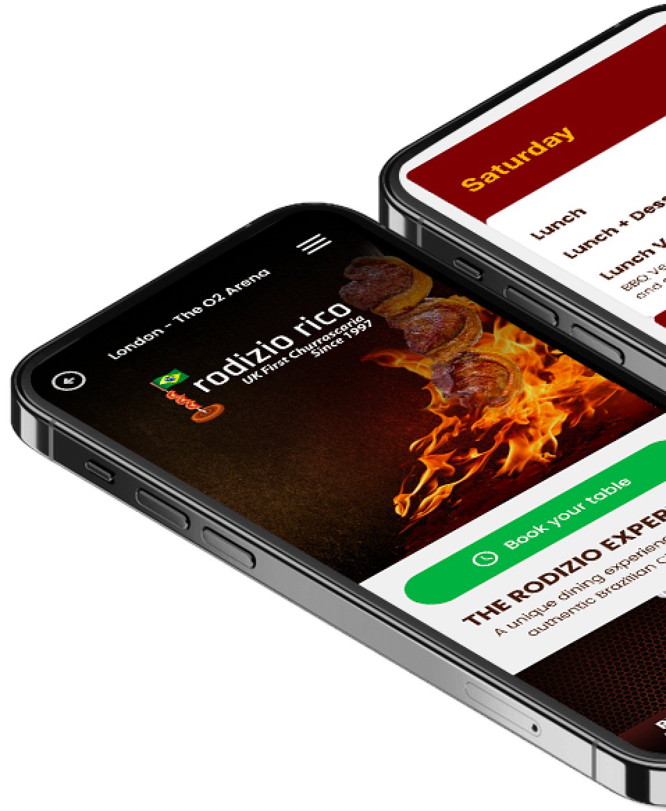
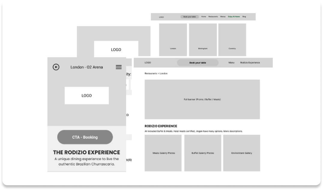
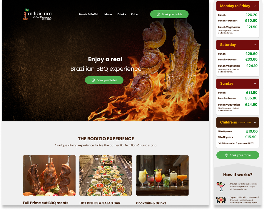
Here is a preview of the final prototype, optimised for navigation for both Mobile and Desktop.
Made in Webflow:
rodiziorico.com
Here is a preview of the final prototype, optimised for navigation for both Mobile and Desktop.
Made in Webflow:
rodiziorico.com
Reflecting back on the project
In this project, I have gained valuable insight into the art of conducting thorough research and synthesising survey data from diverse ethnic backgrounds. By studying various behaviours and preferences exhibited by different ethnicities, I have acquired a deep understanding of how to strategically position elements in UI. This involved careful consideration of the average opinion derived from the survey data, enabling me to make better design decisions.

